

Laserforce
Brand Applications
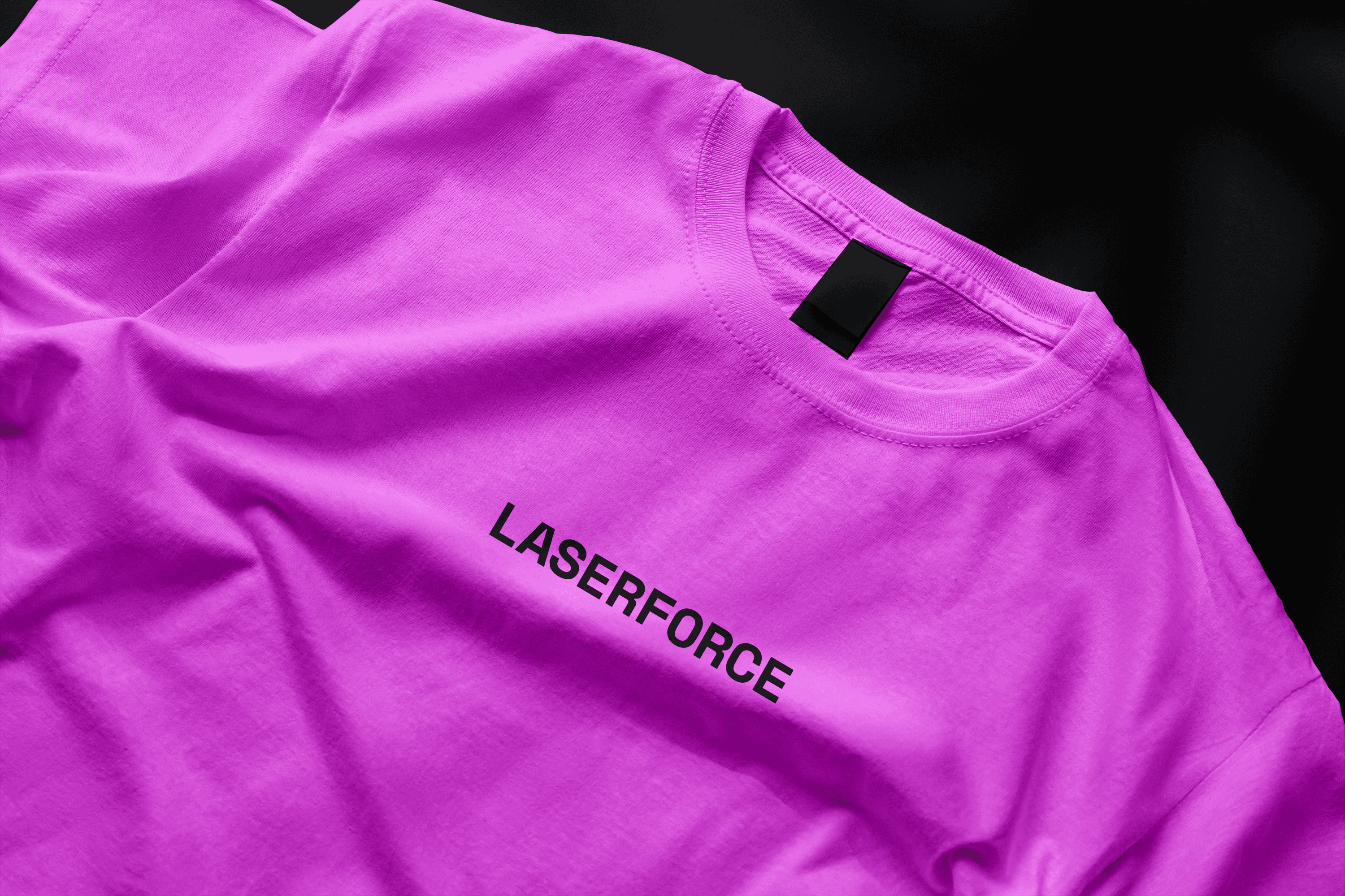
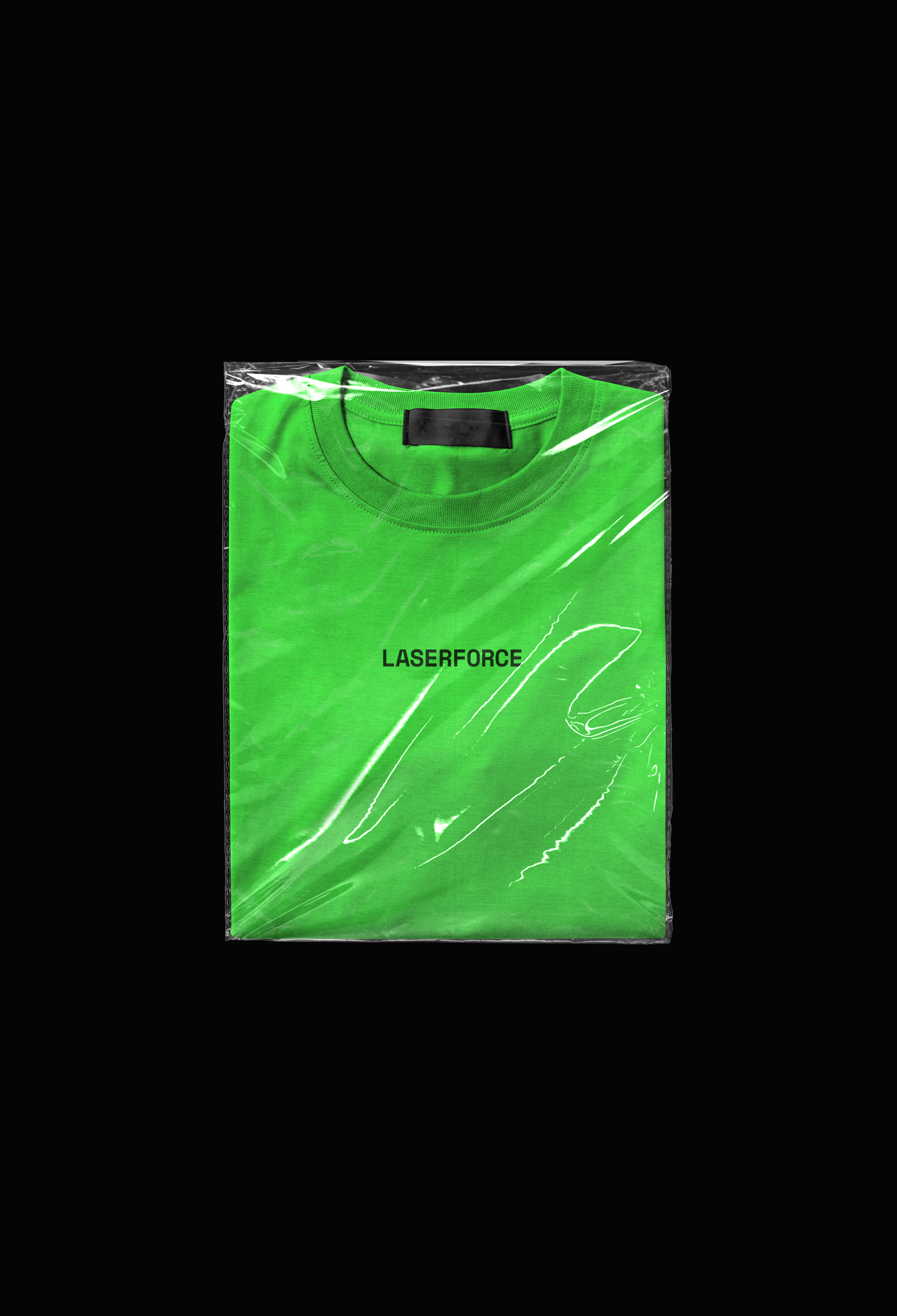
Visual identity design for a Portuguese laser tag events company, focused on creating a modern, scalable brand system for digital and physical touchpoints.
Building a Distinctive Corporate Identity for Competitive Play
(Research)
The project began with an analysis of the laser tag and recreational entertainment market, identifying common visual conventions and opportunities for differentiation. Particular attention was given to the target audience, application contexts, and the need for a brand that communicated energy and technology while avoiding familiar gaming clichés.
(Experiment)
Concept development explored the use of negative space, simplified geometric forms, and crosshair-inspired visual language to create a distinctive yet versatile identity. Multiple iterations tested clarity, scalability, and performance across merchandise, digital platforms, and event environments with varying lighting conditions.
(Specs)
Role
Lead Designer
Client
Laserforce